Flyers | Brochures | Booklets
Project Details
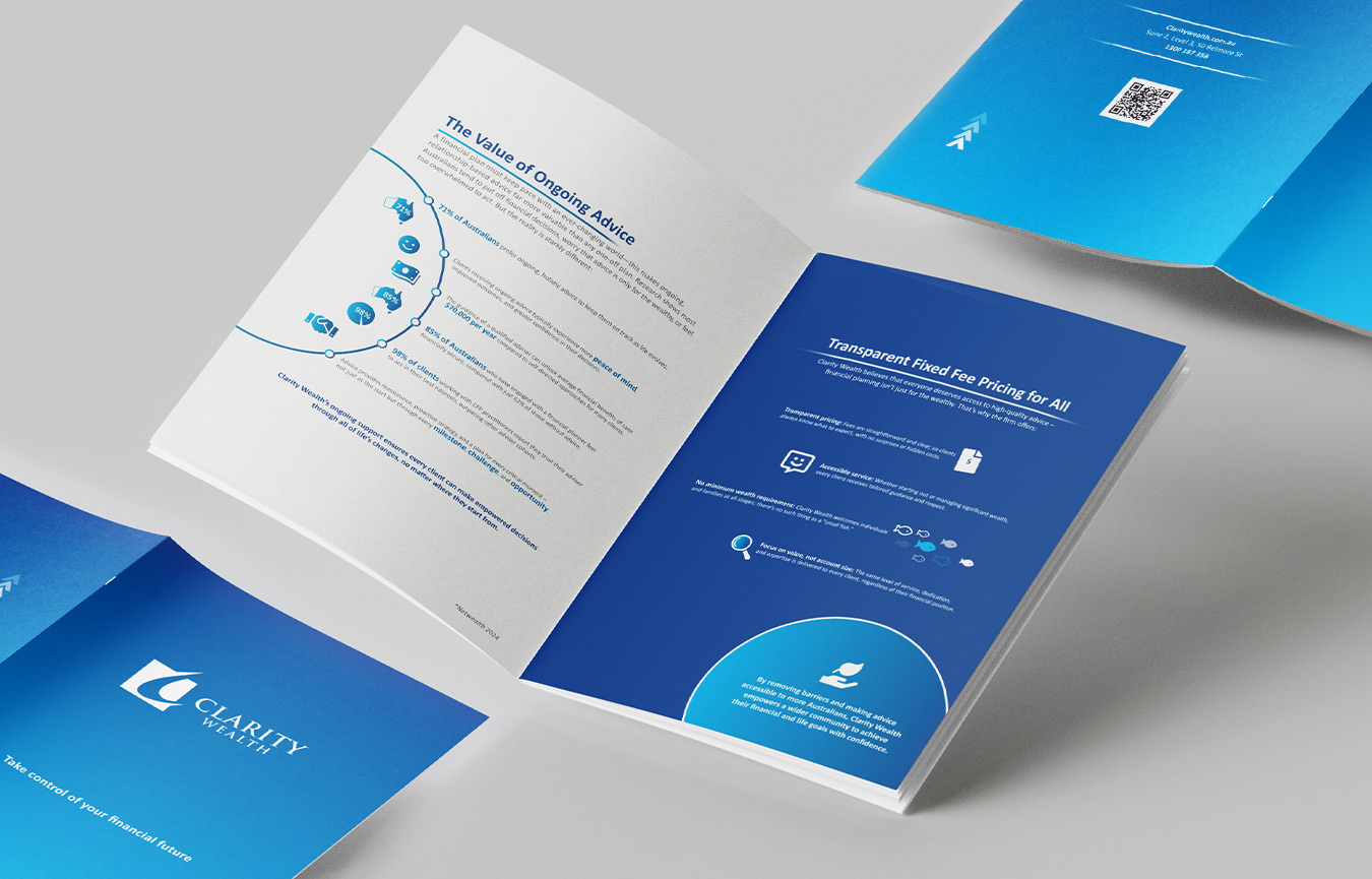
Clarity Wealth Brochure
I created Clarity Wealth’s brand identity, and this brochure puts it to work in print. The brochure had to fill a fixed 8-page print format, so I suggested layout and content changes and pulled sections out into their own pages to fill it. Infographics and information design carry the key messages: the statistics on ongoing advice, a fixed-fee pricing page, and an infinity-loop diagram that walks clients through the five-step Clarity Wealth process. Client success stories sit in their own panels, and the cover and back page carry the brand through with a QR code and contact details.
NZ Roadshow Concertina Flyer
I created the visual identity for HarperCollins NZ’s Christmas roadshow for screen use, and this concertina flyer is the accompanying print piece, showcasing the details and cover art of upcoming books. It had to do three jobs: work folded as a DL flyer, open out as a concertina, and hang flat as a wall poster. To do this, I designed the imagery to overlap across the different fold sections, so each panel works on its own while the whole spread still reads as one piece.
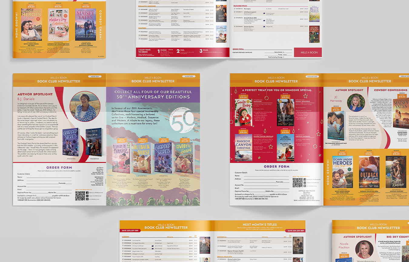
Mills & Boon Catalogue
I’ve produced the Mills & Boon catalogue every month for several years. Each issue mixes varied layouts, such as author spotlights, themed title features and anniversary collections, with condensed, easy-to-scan title listings and an order form. Keeping the template flexible lets me fit a lot of title information into each issue without it feeling crowded.
Hachette Highlights Booklet
For Hachette Australia’s annual conference, Books Change Us, I developed the visual identity, then carried it into an 18-page accompanying booklet showing future release information. Using the same branding in both meant the conference and the booklet worked as one cohesive package. The layered paper-cut cover illustration and bold multicoloured lettering set the tone, and inside, each section has its own colour while the layouts stay consistent, so there’s a lot of title information in a clear, easy-to-scan format. See the animated branding and intro animations here.